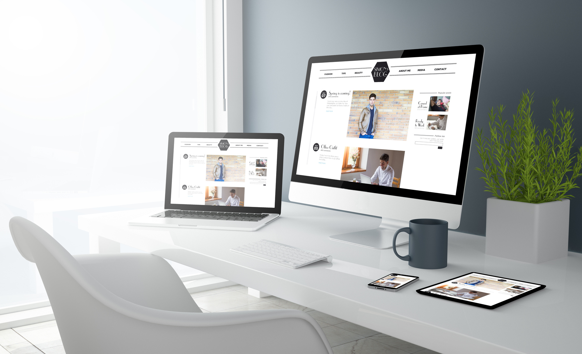
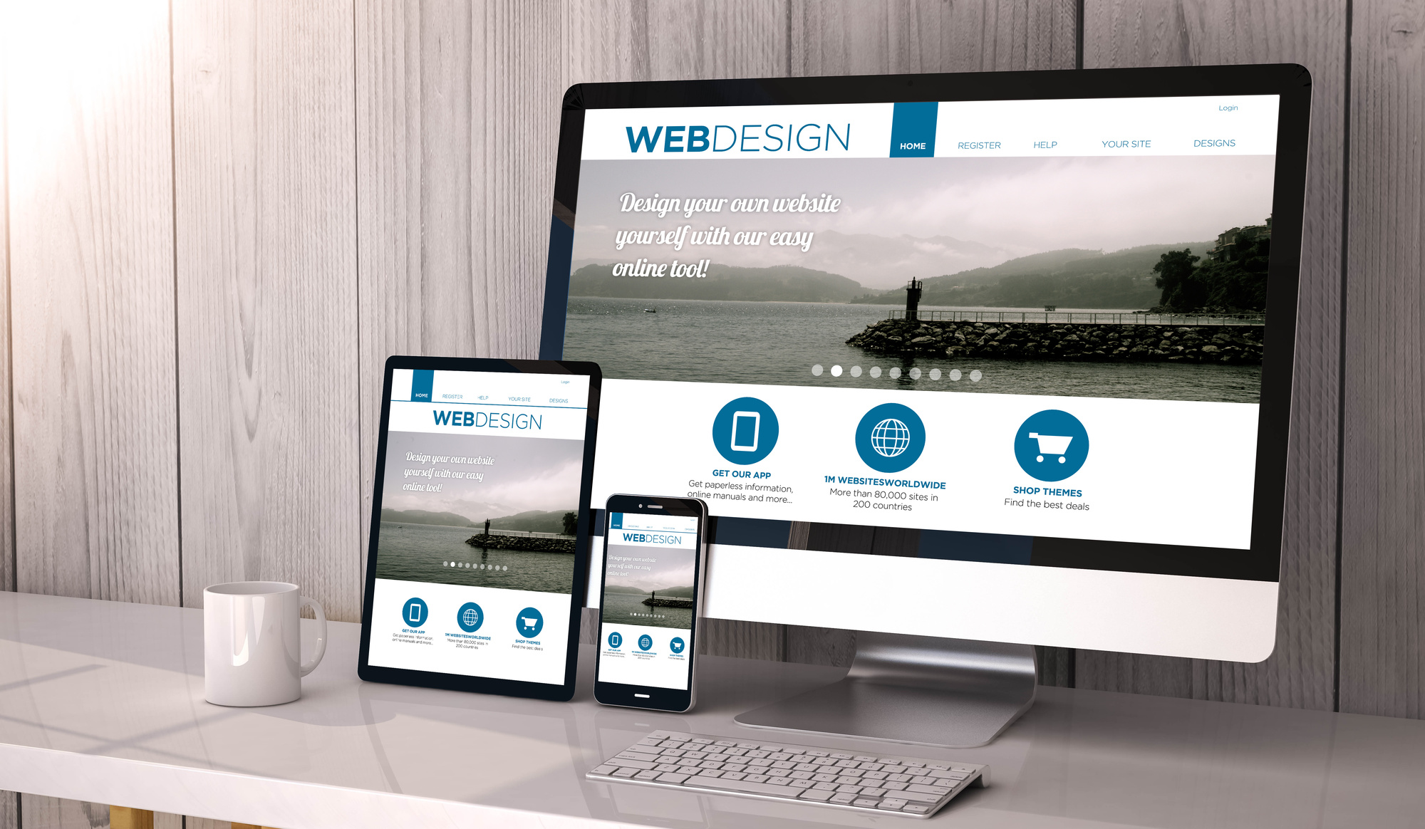
A bad first impression can put a bad taste in a customer’s mouth, this is what happens when you have a bad website header design. Your header is the first place the viewer’s eyes are going to go when they click on the page, and the last thing they see before they leave it.
It’s because you want to make that great first impression that you need an impressive design. Here are 8 website header design tips that will keep your customers from hitting that back button.
1. Designing Your Header With People
If you’re using people in your design you want to focus on making a connection between your customer and the person right away.
The fastest way to make this connection is to use warm, friendly looking people in your header. It goes without saying that you don’t want to have a picture of you frowning everytime the customer clicks on a new page.
Even if a customer has never met you before, repeatedly seeing your smiling face will make them feel like you’re an old acquaintance.
If your website is branding you, put your name, title, photo, and logo in the header. This will be the best way to market yourself.
2. Creating A Header For A Business
When designing your website for your business, the best strategy is to make the header smaller to bring your content higher up on the page.
Make sure to keep it simple, only include your logo, and tagline. Don’t weigh it down with pictures, maybe choose one image and run with it.
When you’re designing for a business, your header isn’t going to make or break it. In some cases, you don’t even need one.
3. Designing For A Thing, Or Product
When creating the logo for the heading, advertise that the product or service is presented by you. This will add instant credibility to you.
You can also add a short list of benefits this makes you look awesome, and also lets customers see if you’re offering the right product for them.
When you’re designing a heading for a website for an event, make sure it has the same energy that the event is going to have. For example, if it’s for a family event it should drip with fun or warm energy.
4. Keep It Simple
A cluttered header can take your customer’s attention away from the overall message of your website. It also makes things a little difficult to navigate.
people like to be able to actually find their way through your site. A simple header allows them to figure out the structure of your site. If the customer manages to get lost in the clutter, they will abandon your site. You don’t want to lose viewers.
Keeping it clean also makes you look more professional, and it doesn’t ask too much of your visitors. Some of the most successful websites out there are ones with fairly simple designs.
5. Dimension
You don’t need a huge header picture for your site. If your website is heavy on content all you need is a short header. Forcing a huge picture there won’t do much for you.
For websites that are offering a product or service, your header serves as a gateway. It will attract them and allow them to tour around your site. For these sites, your header might need to be a bit larger because you need to put a description of the service there.
Dimension is something that you have to pay attention to because it varies depending on what kind of website you’re building. You don’t want to create an awkward looking header.
6. Subject
Your header should tell your guests right away what kind of service or product that you’re pushing. They need to be able to quickly understand the purpose of your site.
An image carousel is a great option if you’re the type that wants to provide a lot of pictures in your header.
There are many ways you can display your work or portfolio the subject that you’re selling if you will, that will reel in your audience.
7. Support
This might seem a little extreme but a good header can even provide your customers with a sense of support.
Just having your name, and a few lines of text can help you build identification with your customers. It convinces people that you only provide the highest quality products and that you have strict standards.
Use your header to communicate quality and experience. This will make customers feel more easy about spending their money on your business/products.
8. Deliver A Message
Lastly, you want your header to always deliver a message. Your header can carry information, and an introduction to your business. These details are a great way to deliver your company’s message.
Use a small amount of text to describe your marketing idea. If you do this correctly, it will keep your customers interested in your message.
9. Master Your Website Header Design
Your header is the first thing that your customers will see when they click on your URL. You want to make a great first impression and let them know that you are a company to be trusted.
Keep your header simple, but with enough flair that gets their attention. Design it based on what kind of business that you’re offering. Build customer loyalty with your website header design.
You want to always keep an updated website. Your products and ideas can constantly change. If you need convincing, just visit our blog.

