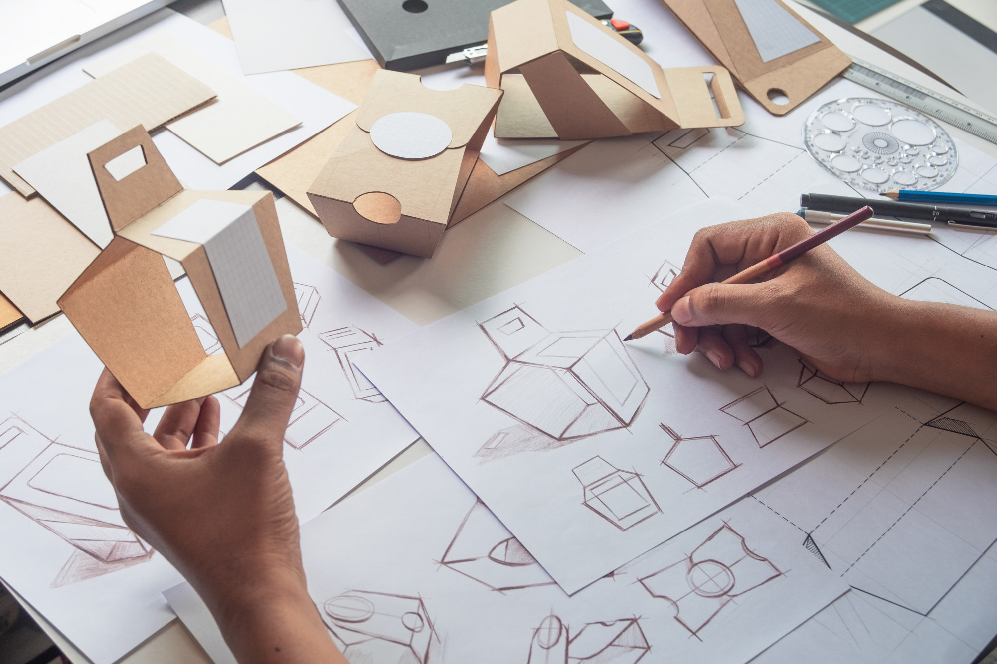
Who could forget the iconic coca-cola glass bottle, the robin egg blue Tiffany’s box, or the ubiquitous Pringles can? It can be difficult to find customers with so many similar products on the market. That’s why you should consider unique product packaging which draws the eye (and sales).
Product packaging is one of the little known but highly profitable types of graphic design. So whether you’re a graphic designer yourself or you want to know what a designer can do for you, we’re here to help. Check out these 10 packaging designs to get some inspiration and see what unique product packaging can do for you.
1. Fit Buns
The success story of Fit Buns product packaging speaks for itself. These high-protein buns use the buns to create a man’s abs. This product was a collaboration between a local bakery and a fitness center.
Each package of buns had a coupon for a free visit to the fitness center. They sold almost 3,000 packages and hundreds of gym memberships in the first month. With a 115% return on their investment, it goes to show that good packaging can drive business on its own.
2. Trident
This innovative Trident product packaging uses gum as teeth on the packaging. It plays well into the product’s claim that it helps protect teeth.
A die-cut window views into the mouths, using female red lips or mustachioed gentlemen. Using a packaging background of pink makes the interior of the mouth look more natural as well. This award-winning packaging should serve you with great packaging inspiration.
3. 3M Earplugs
The product packaging for 3M Solar Earplugs keeps the product’s purpose first in mind. The lid looks like a volume dial, highlighting that they’re for canceling out loud noises.
3M outsourced this packaging idea to an advertising firm. So if you’re not the creative type, that doesn’t mean your product packaging has to suffer! You can hire agencies like this service can create flawless packaging for your product.
4. Volksbier
This unique beer product packaging from Romania tries to make a can of beer look more appealing. This unique packaging concept gives customers an idea of what this beer will look like at it’s very best.
The idea is to use a PET molded container instead of a traditional can. Sometimes the best packaging ideas make your product look like something it’s not.
5. Spine Vodka
This product packaging for Spine Vodka contains what appears to be (but thankfully isn’t) an actual spine. By doing something a little unorthodox, it draws attention to the product. And as an added bonus, the image has strong ties to the brand.
6. Poilu Paintbrush
This product packaging idea for Poilu paintbrushes is sure to make all those who see it smile. All natural hair bristles are dyed to look like various hair colors. Then, the packaging uses faces so the brushes appear to be beards and mustaches.
The larger paintbrush makes up a man’s large handlebar mustache while the smaller brush beneath makes up his soul patch. Using different faces and colored hair makes each package its own unique product. It goes to show just how much comedy can make your packaging stand out in the marketplace.
7. Noté Headphones
This student-designed product packaging demonstrates unique creativity. Her goal was limiting plastic in headphone packaging to be more environmentally conscious. Not to mention the plastic often makes the product difficult to open and provides little functional value.
Here, the earbuds and wires are crafted to look like a musical note. It’s visually appealing and makes it immediately clear what the product is and what its use is. Consider creating something with your product on the packaging as an idea to make it stand out.
8. CS Light Bulb
Created for a Belarus electrical company, this light bulb packaging design is beautiful. Boxes feature insect imagery inspired by old science textbooks. The bulbs make up the insect’s body.
The shape of the bulb determines the insect used. Long, skinny bulbs are the body of dragonflies, while thick, fat bulbs are turned into beetles. This award-winning design is sure to inspire creative packaging ideas.
9. Bee Bright
This innovative packaging idea was a student project designed to redefine honey packaging. Sometimes, all it takes to make a product stand out is to completely change the product’s display. Most companies package honey in a jar made of glass or plastic, but this uses a container made of beeswax.
So here, the packaging is a reminder of the product and has a simple design to make it stand out. The best part: you can turn the packaging over once you’ve used the product and it has a candle wick. That way, you can burn the packaging, making the whole endeavor waste-free.
10. St. Stephen Product Packaging
This design goes to show yet again that product placement on or within your packaging can make all the difference. The base packaging uses a bald woman and the bobby pins become her hair. Several packages offer several different hairstyle design possibilities.
Feeling Inspired?
Never be afraid to go outside of the norm to create something beautiful and unique. We hope these ten exemplary designs have inspired you to create your own beautiful product packaging.
Are you interested in viewing some more inspiring designs? Check out this list of design blogs that’ll get the creative juices flowing.

