We’ve seen those terrible websites that haven’t seen any updates since the internet began. It’s jarring, because we’ve come to expect ease of use while we browse the web.
Surprise isn’t the only problem, though. Bad design also makes it impossible for your potential customers to find the information they want.
It’s more than avoiding bad web design and all the ways it can harm your business. Harness the graphic design potential that modern elements offer your website.
With these top five tips, you’ll be on your way to a streamlined digital base for your clients to interact with (and spend money at) your business.
1. Hamburger Menu
It doesn’t matter if your business sells french fries and burgers. This style of menu look like the layers of a hamburger, and saves valuable space on your site.
Publish the menu options in a toggle screen that pops out when you click on it. Then visitors can find what they need without scrolling through an entire page of options. When they’re finished, it pops back out of the way.
2. Mobile-Friendly
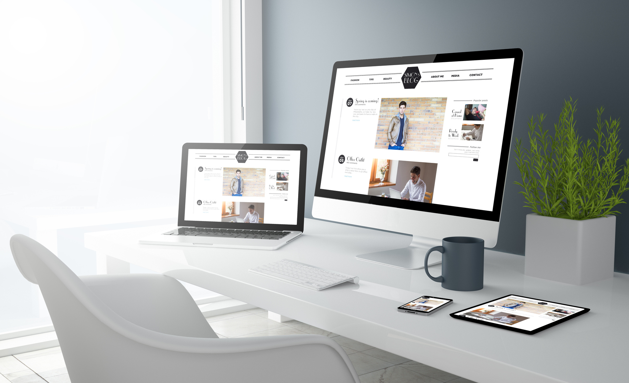
Your sales, your content and blog, and other services offered on your website are only useful to visitors if they can access them from their smartphone. Otherwise visitors won’t stay on your site long enough to find them helpful.
For help making your website’s SEO and content marketing top notch, try Digital Shift. Once the right content is there, focus on making the site easy to use from a device, and you’re golden.
3. Flat Text
Back in the Word Art days, font only worked if there was a shadow behind it. Three-dimensional text was all the rage, and it didn’t look right otherwise.
Today, simpler is better. You look like you’re trying too hard or stuck in the 2000s if you don’t have flat text.
Here’s an extra tip: whatever font you have, use it for the entire site to keep it uniform.
4. Hero Images
No, we don’t mean put Superman’s picture on your front page (or Batman, whatever your jam is). A gigantic photo of something plastered across the home page of your site is often the first thing a visitor notices when they arrive.
Make sure your image is eye-catching and relevant. This photo is a summary of your business, so it needs to count.
5. Best of the Modern Elements for Your Website
The most important feature of your modern website is minimal design. This look makes important things stand out because there aren’t as many elements to distract and get in the way. It’s clean and fresh, and it’s exactly what your visitors hope for when they click a link to your site.
Less clutter on a website doesn’t mean there isn’t room for creativity. Get comfortable with the white space, and find some examples for inspiration.
Get Started
Modern elements like a hamburger menu, a mobile-friendly site, flat text, hero images, and minimalism will take your website to the next level. Your visitors will be able to see how pertinent your business is to their needs.
Visit our website for more graphic design ideas and contact us today for more help and fresh resources.

