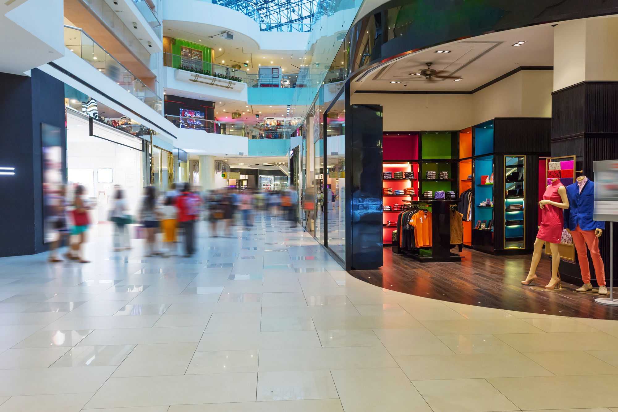
Are you looking for a way to jazz up your storefront’s main window? We’ve got you covered.
Storefronts may almost seem antiquated in today’s day and age of Internet sales and fast online shopping. But they are still an important part of why customers enter your store and help entice them to buy your products.
There is even an entire field of consumer psychology that helps you leverage what scientists have discovered to convert to more sales in your store.
Read on for some of our best tips for creating a stunning, and eye-catching, window display design for your retail space.
Display Design 101: Keep It Simple
This may sound like incredibly cliche advice, but cliches exist for a reason. Simplicity is the key to creating a winning window display design.
If you overwhelm your potential customer, they’ll likely just keep walking and not even consider coming into your store. As such, you need to stick to one central theme instead of overwhelming potential customers.
Image360, for example, uses simple lettering on window fronts to help get customers into the store.
Images alone work well for storefronts that may be retail but are more specialized. These can be items like high priced goods that individuals have already researched before stepping into your store.
You can also combine script and writing or design on the windows with a display.
But above all, keep it so your potential customer is focused on your logo or products.
Inspire Your Customer
Your brand is more than what you sell. Your brand represents an entire ethos or an ethical code. As such, you want to inspire your customer as well as entice them with your products.
You can do this in a variety of ways. Inspiration can come in the form of individuals achieving great things while wearing your clothing, or quotes in the window illustrating what they can do with the technology you’re selling.
Let your customers know that your brand is there to not only fulfill the niche your as a retailer but to help them on their life journey.
A very inspiring display can also make someone stop and think, which could lead them to come into your store.
Use Blues
Many individuals go for bold colors to entice individuals. This is especially the case on storefronts in big cities where they must compete for the pedestrian’s attention.
But according to consumer psychology, blue creates a feeling of trust with your audience.
Although you can’t use blue in every single window display, you may want to feature it as often as possible. Keep track of how often your items sell or the foot traffic when your company features blues in its display.
Keep the Lights Dimmer
You may think that bright and flashing lights will attract customers to your display window. This may be the case if your storefront is situated on Times Square. But if it isn’t, you’ll want to keep the lights dim.
Studies have shown that dimmer lights in a window display promote a feeling of relaxation. This can mean that your display instills trust or a calm feeling in individuals passing by.
This can work well to your advantage, especially if your storefront is located somewhere with lots of hustle and bustle and foot traffic. If your storefront helps someone slow down and relax, it could mean they’re more interested in seeing what it is you’re selling.
Make It Entertaining
Incorporate a joke or a pun into your display design. This gives people a laugh and something to talk about with their friends and family. The fact that your window display gets them talking is a fantastic way to promote brand awareness.
It also means more people might be motivated to enter your store based on your sense of humor.
Keep the Longevity of the Display in Mind
You shouldn’t rush out and purchase expensive materials if you’re only going to use your display for a special event. However, if you’re going to have your display in the window for several months, you may want to invest.
In some cases, some stores may want their display in the window for several years. This may be a core display and a changing display.
If you want a display that changes often, consider trying to get creative with what you have. There are many things you can do with window paints or other materials you have lying around.
Draw up a design of what you can do using materials found around the store or even around your house that you are fine with letting the store use.
Create Levels
Don’t just display your items on one boring shelf. Instead, you can create levels with a variety of mediums and effects. You can use shelves, as this is the easiest way to incorporate this effect.
However, you can use other strategies to create levels. For example, you can place a ladder in the window and display some of your items on the ladder. This is a cheap and easy way to use all of the space in your window.
Unless you’re displaying one single and very special new item, maintain levels to make sure that you use all of the vertical space available to you.
The Best Design for Your Business
Ultimately, you or creative individuals in your office will create the best display design for your business. Remember, the main purpose of your display window is for people to come into the store. But they should also engage with your brand in a way that shows that your company is not just limited to the things they sell.
For more information on utilizing graphic design, as well as tips and tricks, visit our website.


