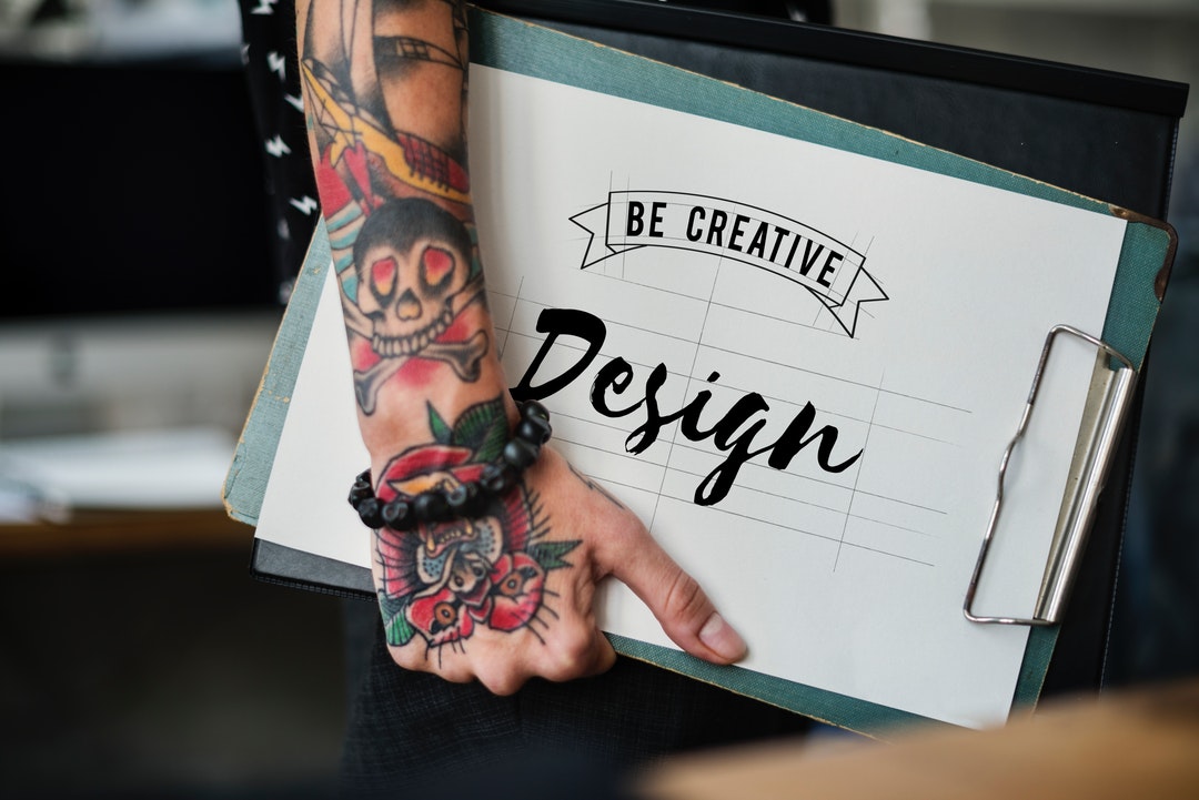
Are you are looking to get started with a career in graphic design?
Then you really do need to sit down and wrap your head around the graphic design fundamentals.
Why?
Because fundamentals shape the foundation upon which you can build both your reputation and your brand. A great career is formed on the back of these two components.
Besides, even the very best designers never allow themselves to lose sight of the fundamentals of their craft. It is a grounding element as well as a basis for design.
What are these fundamentals you might ask? Well, keep reading and find out for yourself.
1. The Line
When it comes to the formal elements of art the line is the beginning and end of it all. Used for everything from adding style to creating shadows and space between other elements of the design.
You may be forgiven for thinking that a line is a line, but nothing could be further from the truth.
You have:
- Horizontal lines
- Diagonal lines
- Vertical lines
- Solid lines
- Non-solid lines
- Pattern lines, and
- Freeform lines
Once you understand the basics of lines, then not only are you ready to move onto the next phase of your learning, but you can start playing with the concepts. Creating designs is a great way to hone your craft even more.
2. Shapes
Whether you are talking organic or geometric, there is something about shape that forever catches the eye.
Different shapes have different meanings when it comes to graphic design principles. Squares are stable, true and equal. Triangles are the shape of action and aggression, while circles are used for movement and freedom.
Natural shapes are a wonderful tool for creating the illusion of a scene. From trees to rivers, the correct choice of shape is all it takes to conjure an image in the mind of the viewer.
3. Color
If you want to learn about graphic design fundamentals then you must learn to understand color.
Yes, color draws attention and adds a dimension to an image but it is also much more than that.
Color is emotion, it is feeling. The right shade can drastically alter the mood of an image and capture a subtlety that words just cannot truly do justice.
When you are learning about the core graphic elements make sure you spend the time to learn about color and the meaning behind the shade.
4. Texture
There is something evocative about texture. When used in graphic design it evokes a range of sensations and experiences. When used rightly it adds a subtle flare that changes the tone of an image.
The right use of texture can help you:
- Create visual depth and resonance
- Draw peoples eyes to a certain point of your design
- Elicit a desired emotional reaction
Texture is a great way to catch someone’s eye and draw them into your design. Play around with it, find your favorites and work them into your brand to create that signature look you will want.
5. Space
If there is one key design element that you must learn to master, it is space. Whether you are using space or using negative space, both have an equally important role in design.
Negative space is one of those special graphic elements that can take your design to the next level.
Whether you use natural space, negative space or create the illusion of space understanding this fundamental concept is imperative for a long career in design.
6. Size and Scale
You know you understand the formal elements of art when you realize that size does matter. Getting the right size for your image is important.
Too large and you lose focus on the core message of your design. Too small and people may miss something crucial.
Understanding size is also understanding that there is not one golden rule. You want a sense of proportion in your designs, but there could be times when you need an image that is over or under-sized because the contrast it brings to what people expect to see is the most effective way to getting across your message.
Being able to use the subtle nuances of sizing you can make grand changes to a design without altering the base concept you are working with.
7. Typography
To serif or to sans-serif that is the question. For those that understand the graphic elements of design, knowledge of fonts and their uses is a crucial lesson to learn.
Your message can easily be lost if you get the letting on your design wrong. Is script too hard to read from distance, do block capitals ruin the visual effect you are working to create?
There is a lot to play with when it comes to your use of typography in design, not merely because you are not bound by common social conventions of horizontal lettering. You have the freedom to move in any direction you need, and that opens up a nearly infinite level of design concepts you could use.
8. Contrast
When people think about contrast they often think about color, or that setting on your television that can make the picture horribly vivid.
However, there is much more to contrast than just color.
Contrast is:
- Color
- Shape
- Typeface
- Size
- Texture
Contrast is what will break up the different components of your design and attract peoples eyes to certain places at the right times.
9. Balance
Balance is all about placement. It is about finding the perfect spot for each element you are using in your design and doing so in such a way that the overall product is not thrown off.
It is a fundamental design element to experiment with, but one that is vitally important to master. An unbalanced design will miss the mark and the intended message will fail.
Mastering balance is about positioning light and dark so that they compliment. Each can overpower the other when needed, but it depends on the mood you intend to capture.
10. Harmonization
Harmonization is one of the final graphic design principles you need to master, and ties together with everything mentioned above.
Harmonization is all about balance and ensuring that the correct stresses are being applied to the necessary elements to effectively direct people’s focus to the relevant parts of your design.
The Sky is the Limited With Knowledge of the Graphic Design Fundamentals
Once you have mastered the core graphic design fundamentals then there is no stopping you from developing into a groundbreaking designer.
You can take any piece of graphic design work and extract the above elements from it, deconstructing it piece by piece.
Conquer the basics and you can conquer the world.
Are you ready for more? Check out some of our other design articles to further deepen your graphic design knowledge and skillset.


