When given 15 minutes to browse a website, 66% of people would rather read a site with a beautiful design than with something plain. Beauty is in the eye of the beholder, but the prevalence of minimalistic websites suggests that many users do find them beautiful.
What is minimalist website design? How do you know if you should have it? Will it help or hinder your brand?
If you’ve been asking yourself these questions, you’ve come to the right place. We love helping people figure out which design decisions will best position them for success.
In this guide, we’ll discuss what a minimalist website has and what it doesn’t have. Then, we’ll talk about the pros and cons of this type of design.
Keep reading to find out if a minimalist web design will suit you and your company.
What Are Minimalistic Websites?
These types of site designs, as suggested by the title, favor the less is more approach. You won’t find flashing banners and multiple pop-ups on minimalist sites. They don’t have multiple tabs or drop-down navigation menus.
To a minimalist, all of those elements would be nothing more than clutter. To a minimalist, there’s only one place for them–the gutter. (The outside gutter, not the padding between design elements.)
All rhyming aside, these types of design are about using as few elements as possible while still conveying meaning for the user. They’re streamlined and simple.
Of the elements on a minimalist site, you might see large images, high-quality images. These images have the effect of conveying–without words–what’s most important to the user. They’re usually directly related to a product or service.
Bold typography is also common. When you’re working with only the most necessary elements, the words themselves become an artistic expression. You might see as many as three different typography styles, all designed to attract the eye.
High contrast is another common feature. The difference between gray text and a bold yellow, for example, creates visual energy. This energy draws the eye in.
The final marker that you’re browsing a minimalist site is plenty of negative space. Often, it’s white, but it could also be other colors. More negative space provides a cleaner look.
Now that you know what these designs look like, let’s get into the pros and cons so you can decide if you should adopt this style.
Pros Of Minimalist Design
There are many reasons why an individual or company might decide to go for this style on their website. One of the main advantages is that it’s unlikely this style will go out of fashion any time soon. Just look at how long minimalist furniture has been popular.
But aside from popularity, there are a number of pros to using a minimalist approach. They include:
- Effective at converting consumers
- Easy to browse
- Faster website
- Search engine friendly
- Fewer hassles
- Memorable
- Responsive design
Let’s look at each of these in more detail.
Converting Consumers
Minimalist sites convert more consumers because the path to conversion is so clear. Without excess information or modules to distract them, they can get right to buying.
Easy Browsing
Users enjoy browsing minimalist sites because of that clear path. They don’t have to think too hard about where to go next. They consume the intended messaging without bouncing from the site.
Faster Website
Websites that load faster provide a better user experience and rank better in search engines. If a website is loaded with clutter, it will take longer to load.
Search Bot Friendly
Search engines send bots out to crawl websites in order to index the website’s information. The simpler the site, the easier it is for the bot to crawl. The easier it is for the bot to call, the happier the search engines are.
Happy search engines mean a greater chance at high search engine results page (SERP) rankings.
Fewer Hassles
The more plugins and widgets a site has, the more there is to manage. Plugins are like software; they have to be regularly updated in order to function. Minimalist sites, once built, are less work.
Memorable
Users are more likely to remember something that’s simple and clean-cut. It’s like memorizing a song–what’s easier, “Mary had a little lamb” or “Bohemian Rhapsody?” When consumers remember you, they’re more likely to come back and convert.
Responsive Design
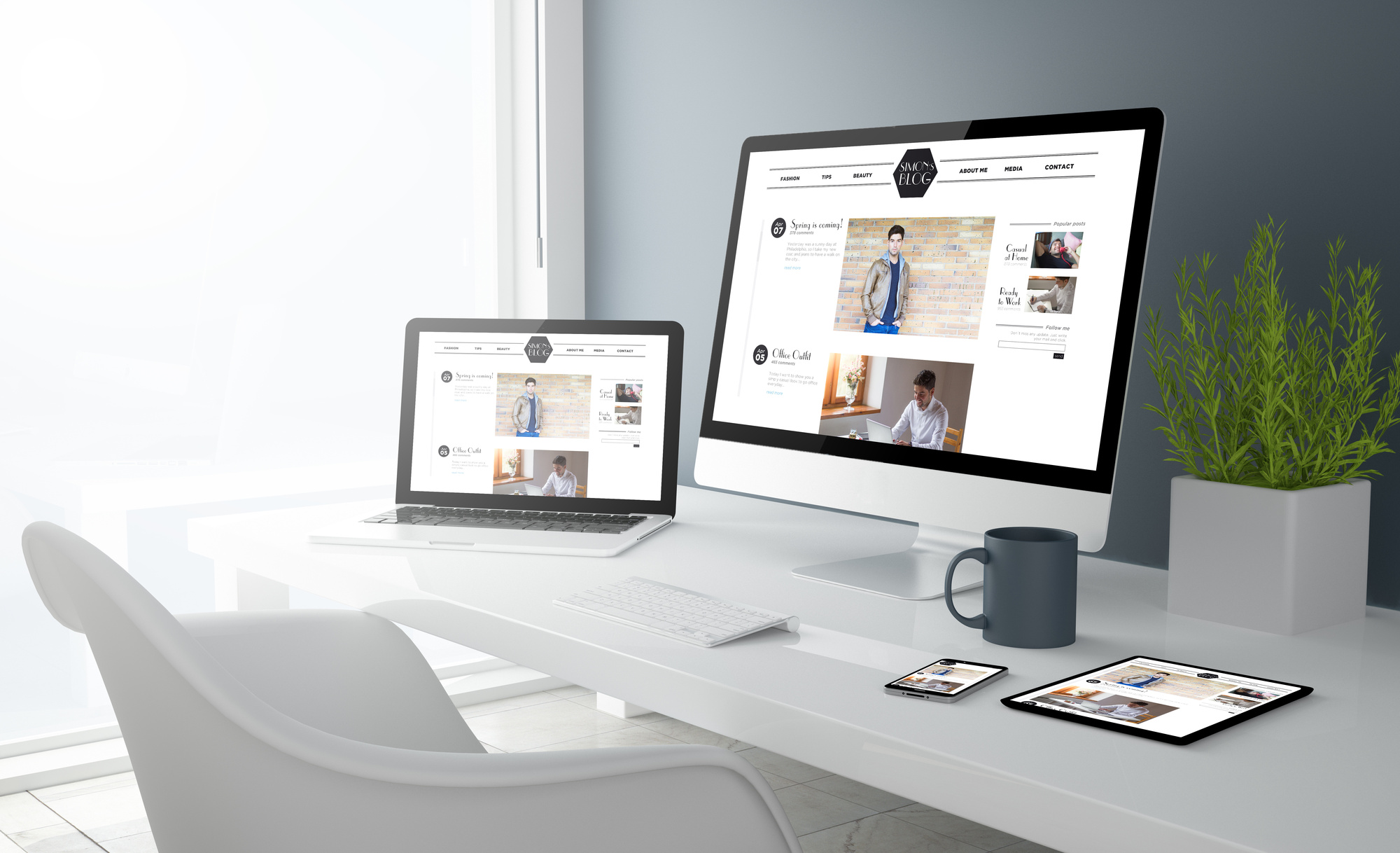
Responsive design is what makes a website look great no matter what size screen someone is using. From phones to giant monitors, a website with responsive design will look great no matter what. Minimalist sites are easier to design responsively because there are fewer components to resize, there’s plenty of negative space, and important text is usually bold.
43.6% of all website traffic worldwide is generated through mobile phones. You don’t want to miss out on almost half the world’s traffic.
Cons Of Minimalism In Web Design
No design is a one-size-fits-all approach. For some brands in some industries, minimalism will deter users from staying on your site. Potential cons of minimalist design include:
- If you go too far, your site can look unfinished.
- You might have difficulty conveying value with so few words.
- If you don’t plan ahead, a minimalist design can hold you back when your company grows.
These disadvantages are few and far between, and in most cases, preventable. So if you really want to go minimal, and you take the right approach, it can serve you well.
Conclusion: Ready To Minimize?
You know now what a minimalistic design includes–and what it doesn’t include. You know what some of the pitfalls of this style can be. You’re excited about the potential advantages for your website and your brand.
It’s natural after contemplating your website design to be uncertain if a particular design will serve you well. After all, your website design is the face of your brand, online.

